The Tamarind Resort

Identity, Signage & Wayfinding

Art Director: Clarissa Amabel
Graphic Designer: Enrico Emmanuel
Copywriter: Mar Galo
Production Manager: Adityo Cahyo
Account Team: Dianti Saddono

Architecture & Interior Design: Diastana Design
Signage Fabrication: 

Nestled on the hills of Jungutbatu, The Tamarind is a boutique five-star resort in Nusa Lembongan. Studio 1212 defined a distinctively fresh approach for an intimate, thoughtful, and light-hearted resort experience like no other on the island.

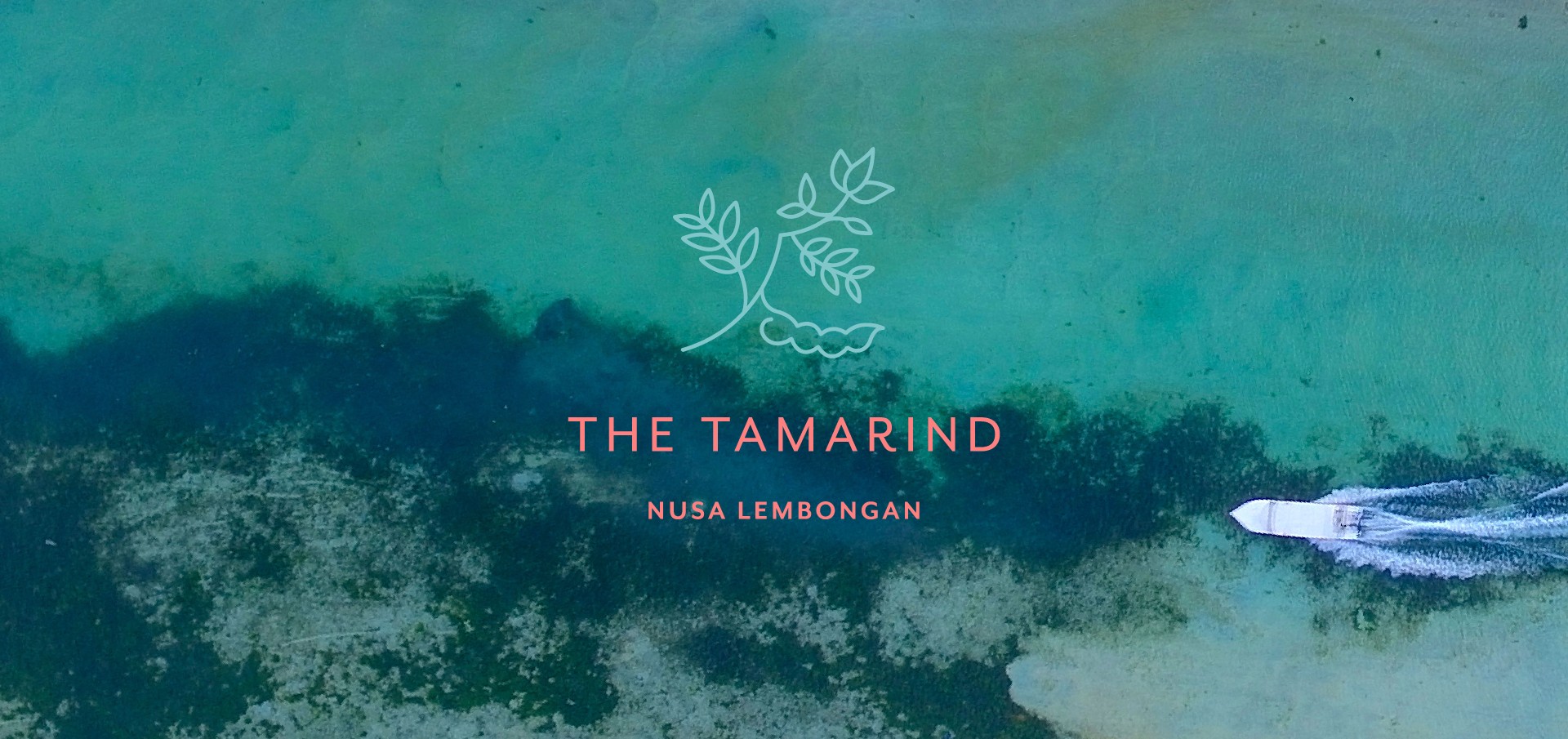
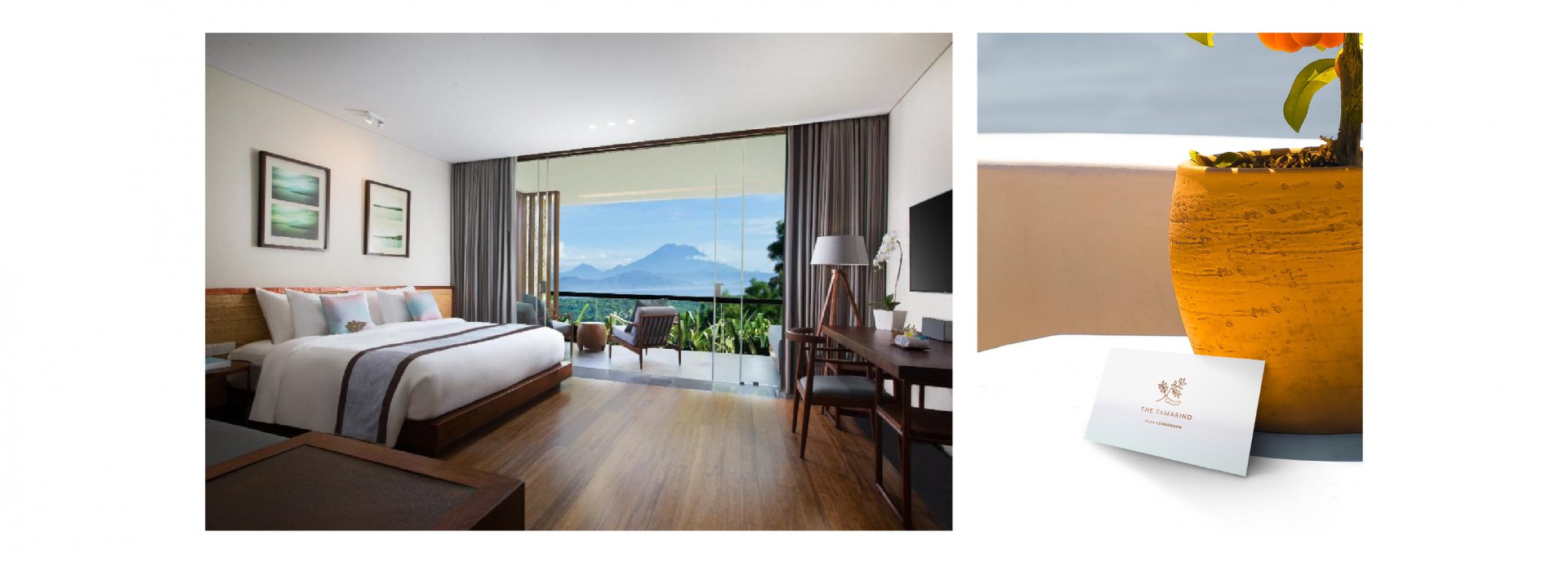
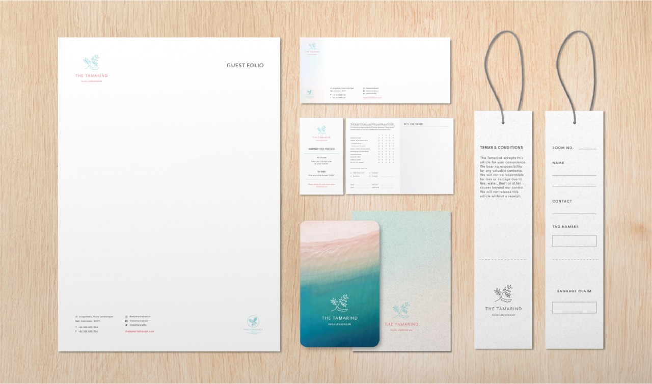
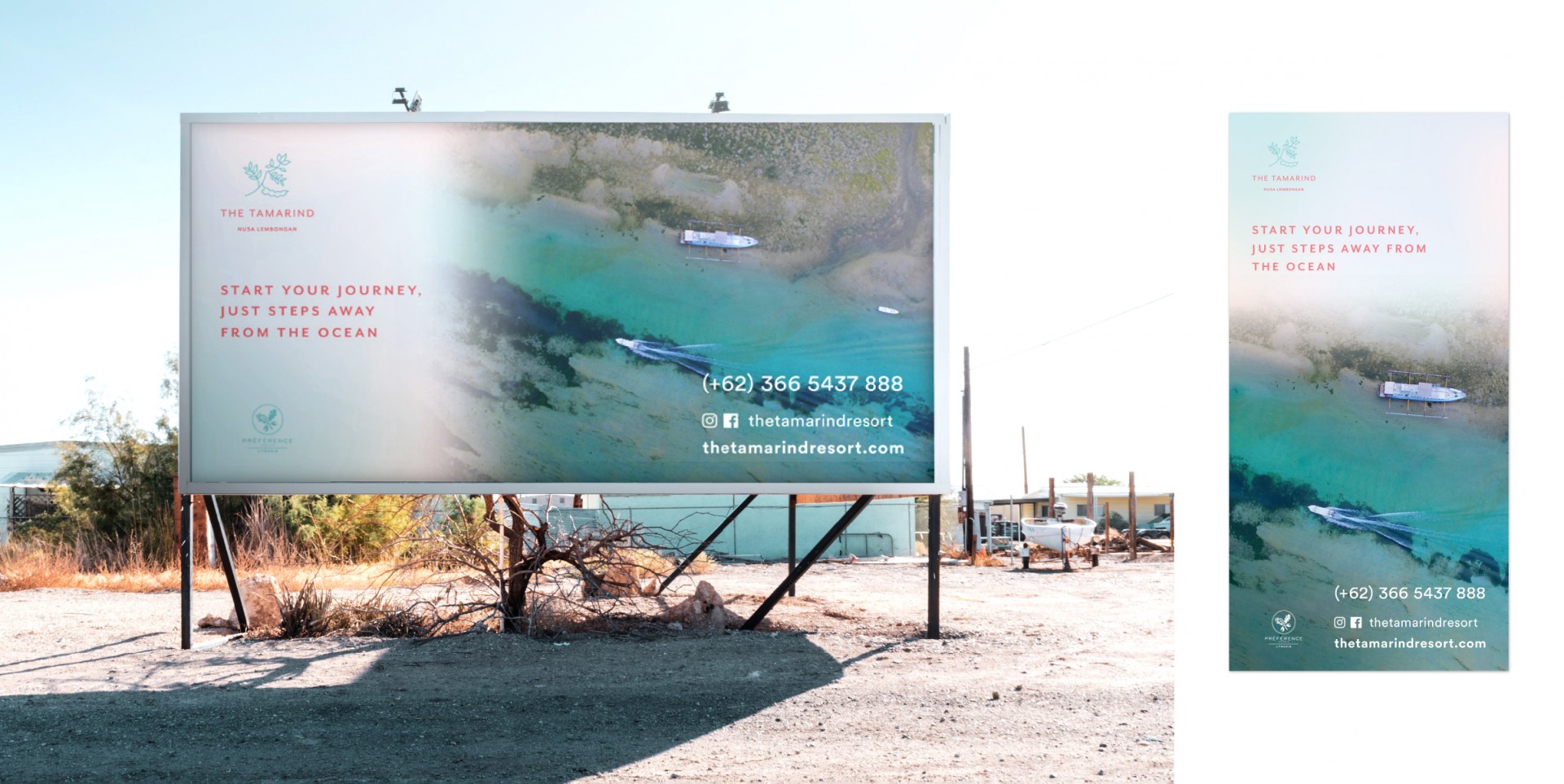
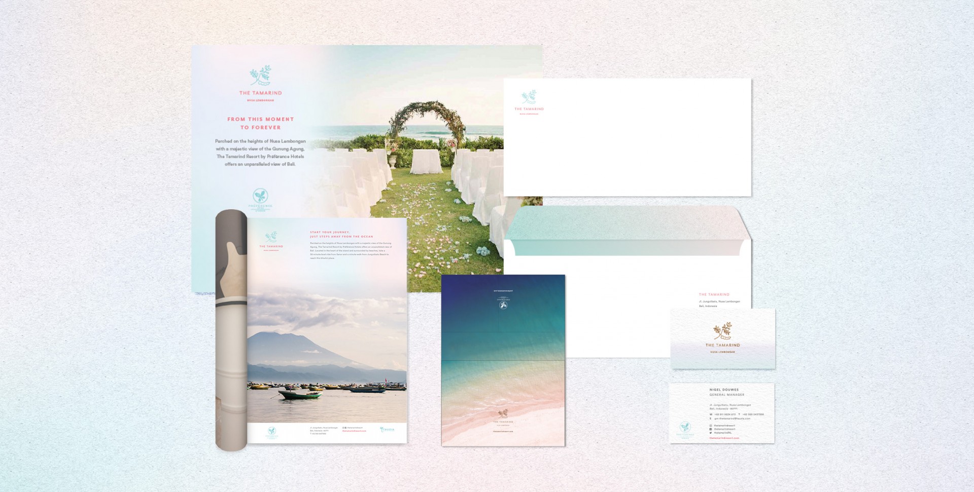
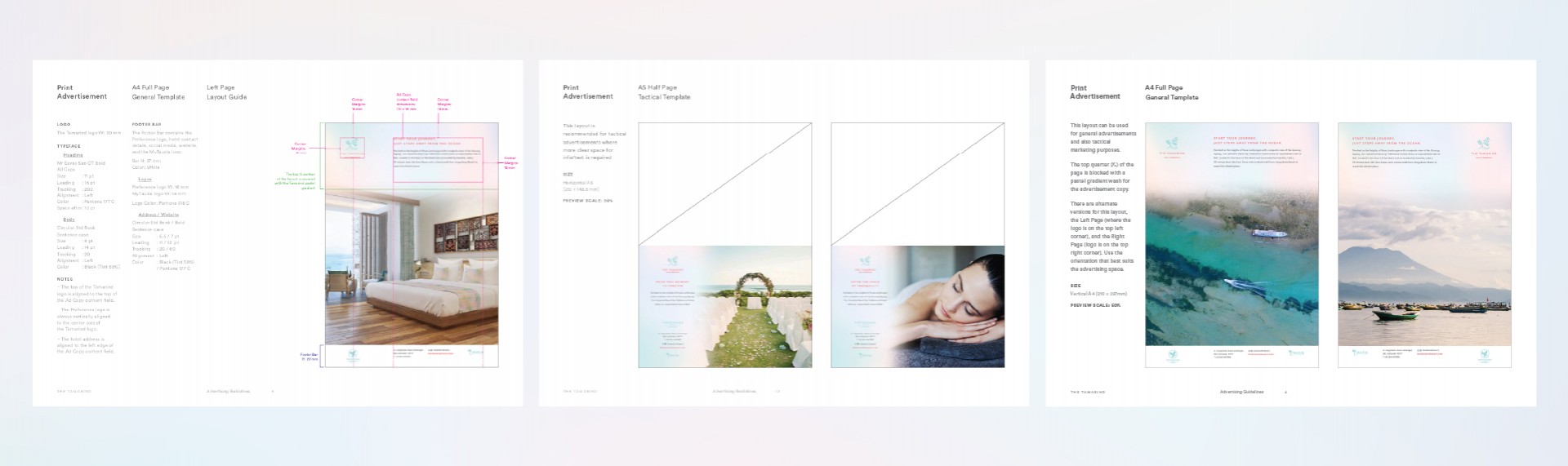
The client, Preference Hotels, approached us with the challenge of creating the branding narrative & design for a new 12-room resort in the quiet Nusa Lembongan island.

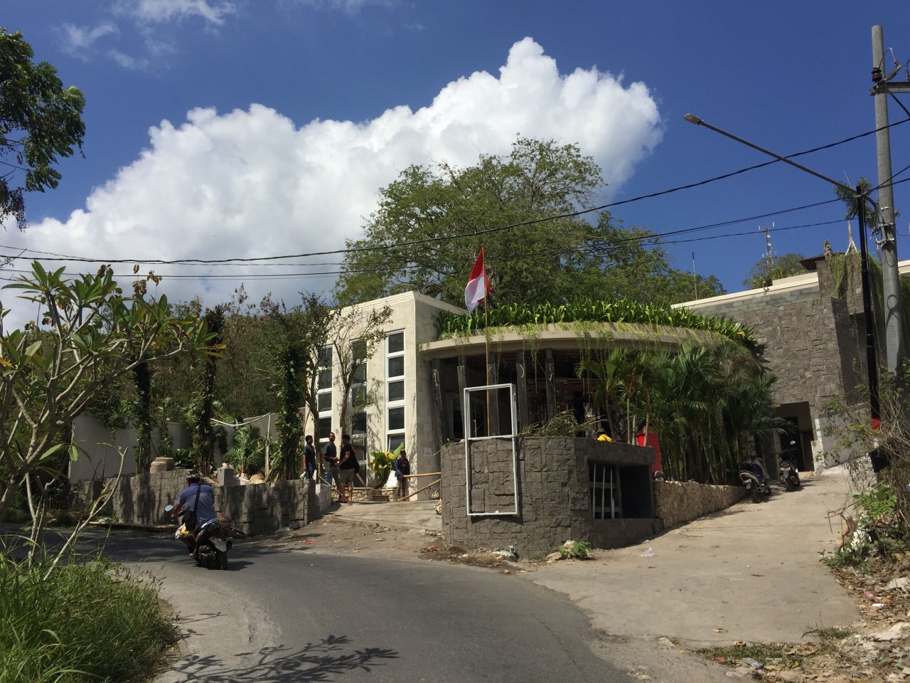
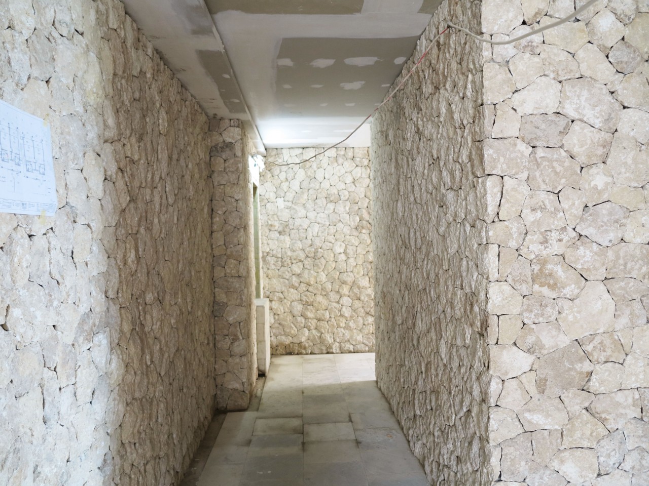
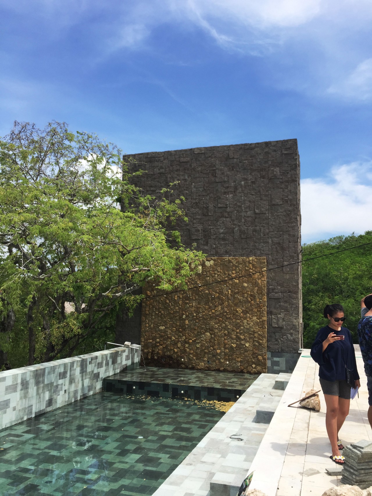
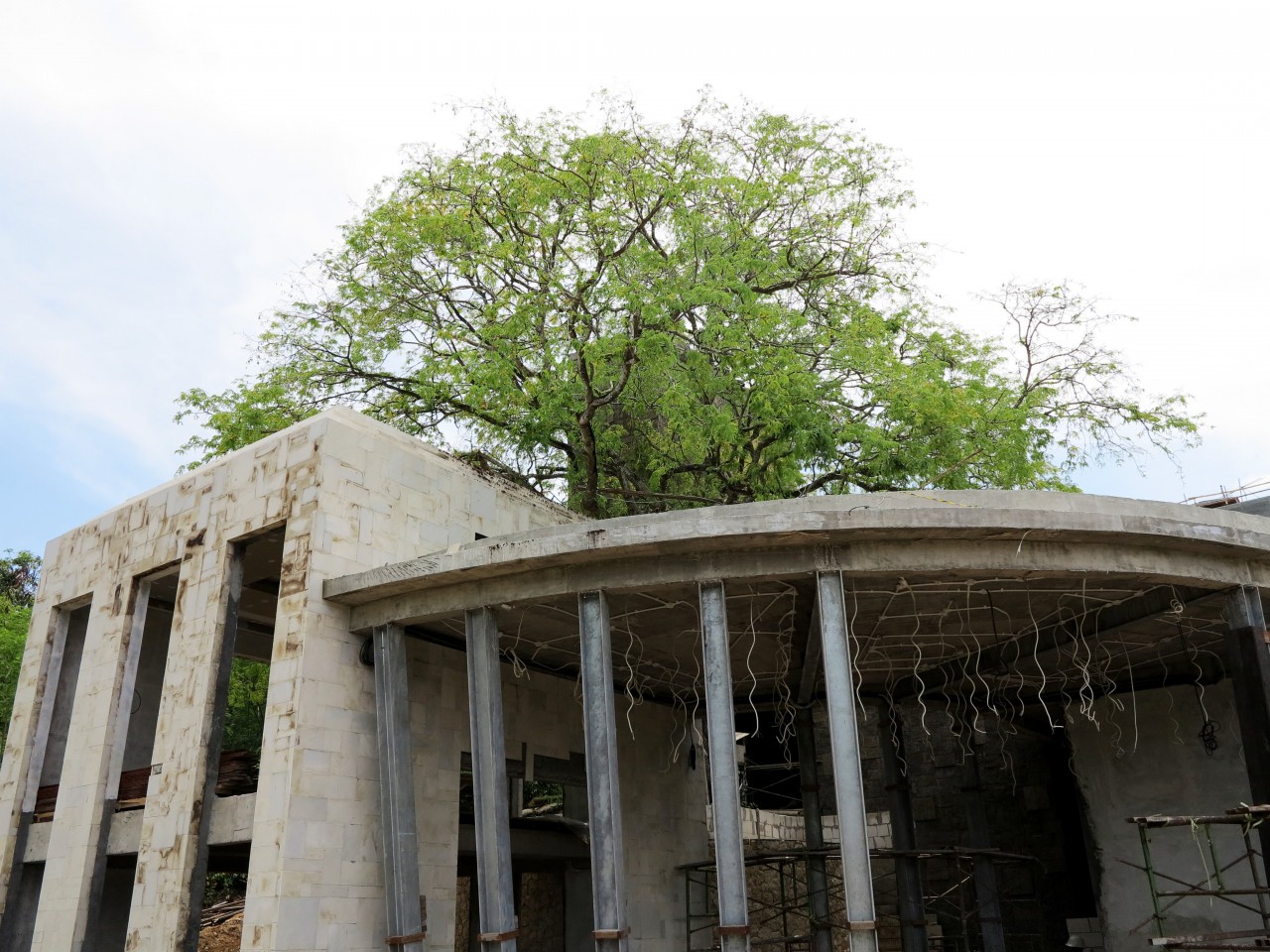
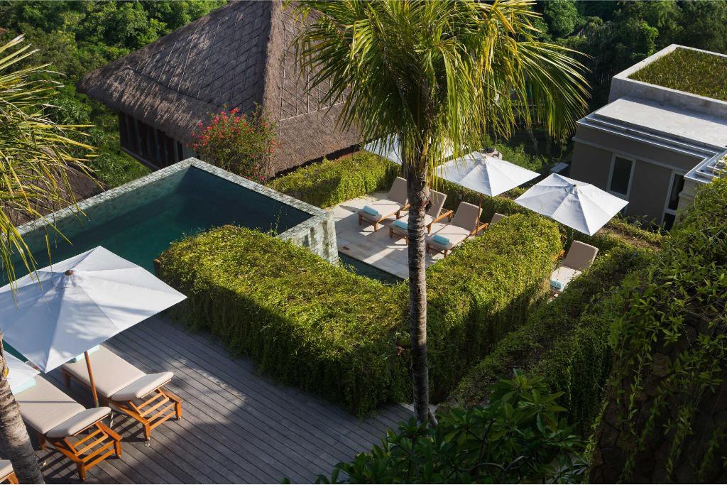
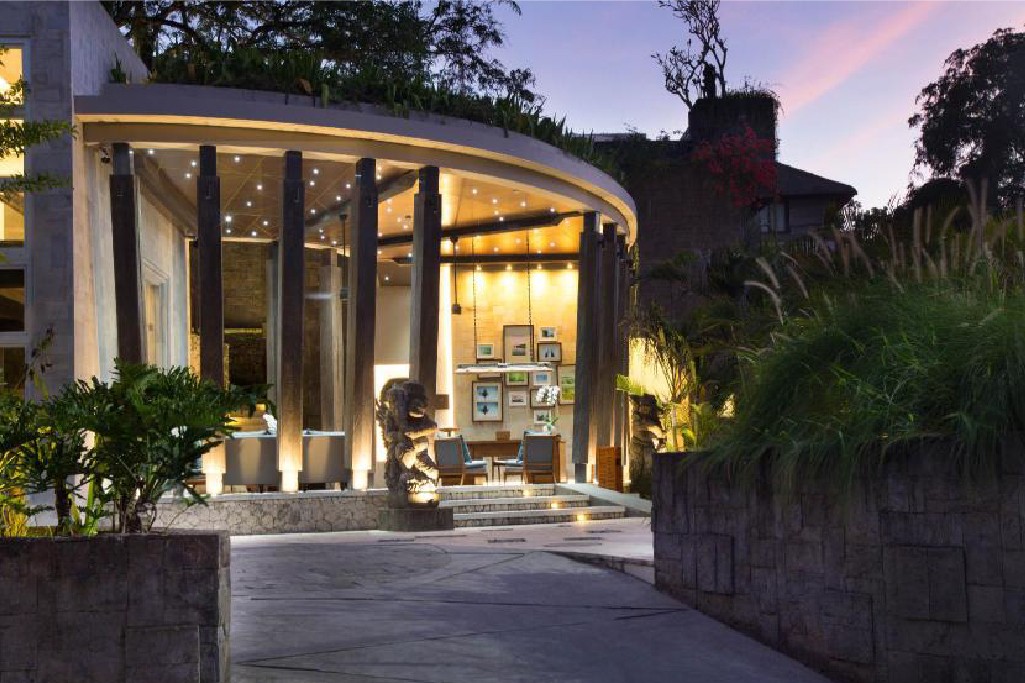
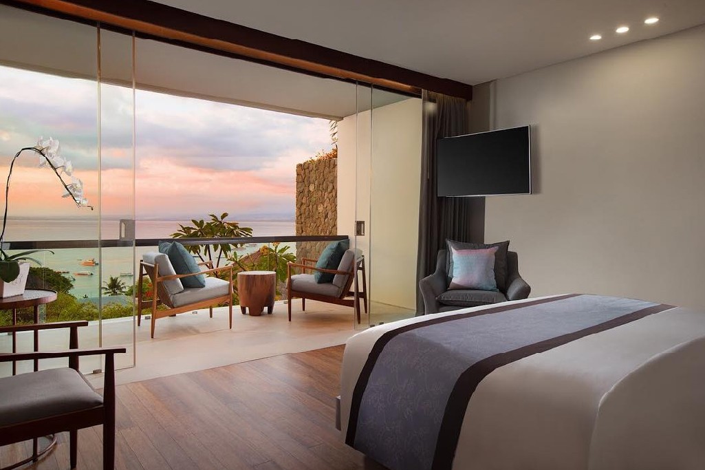
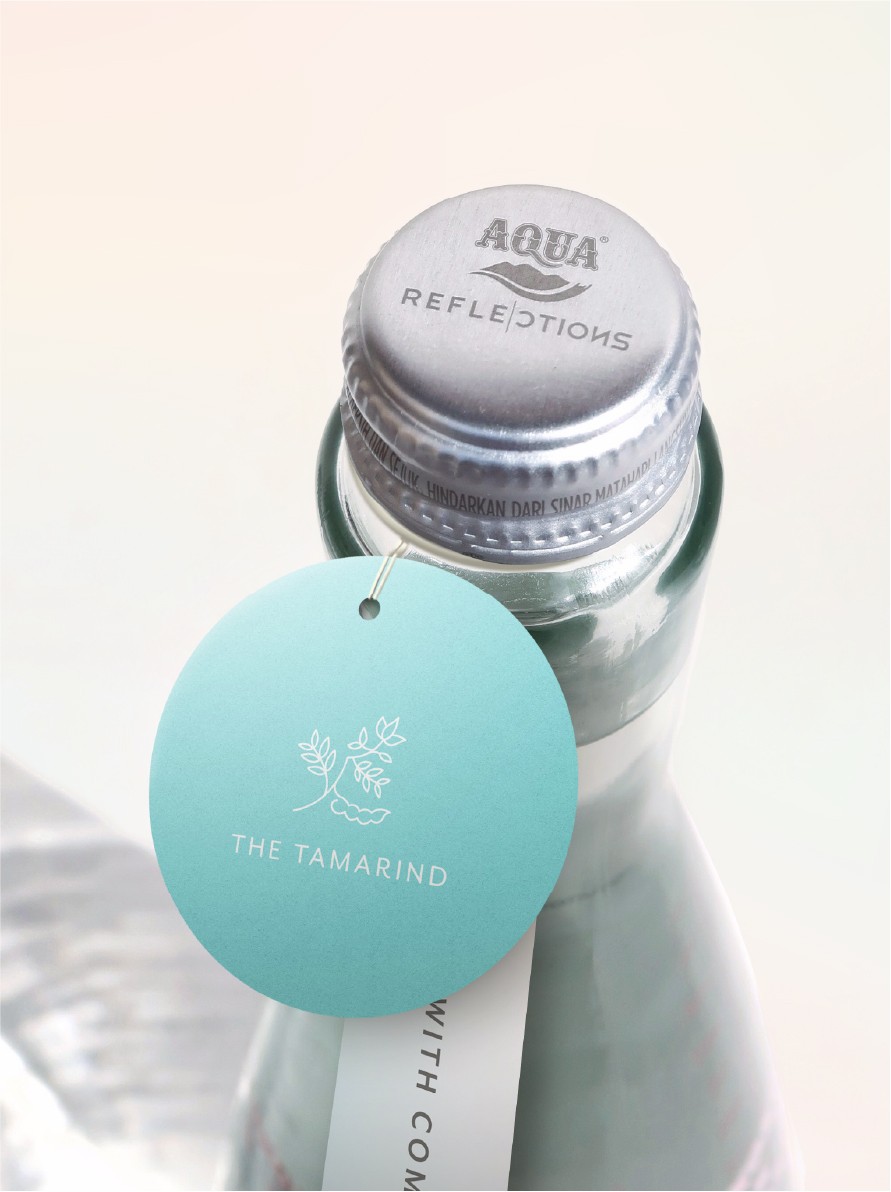
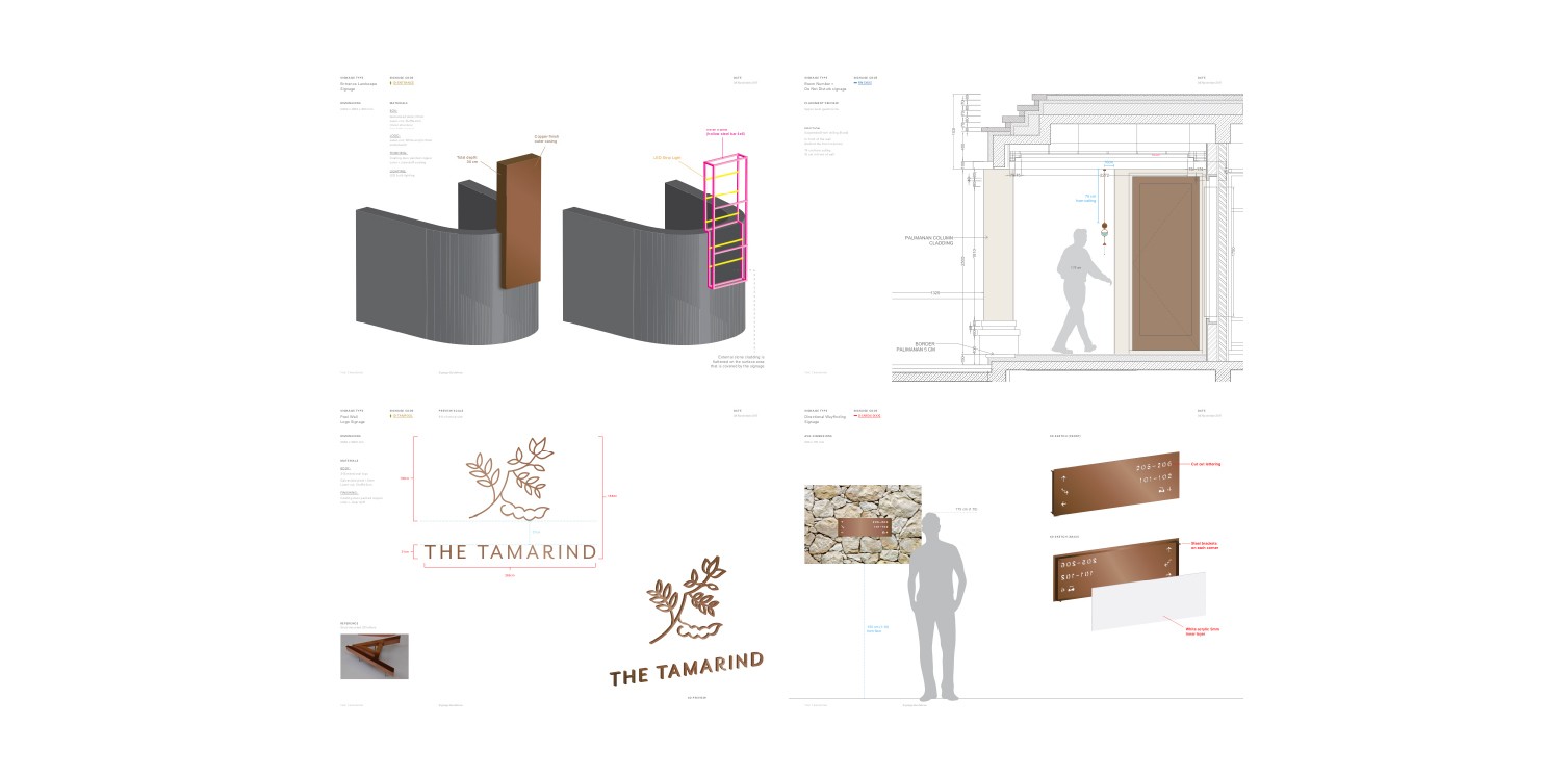
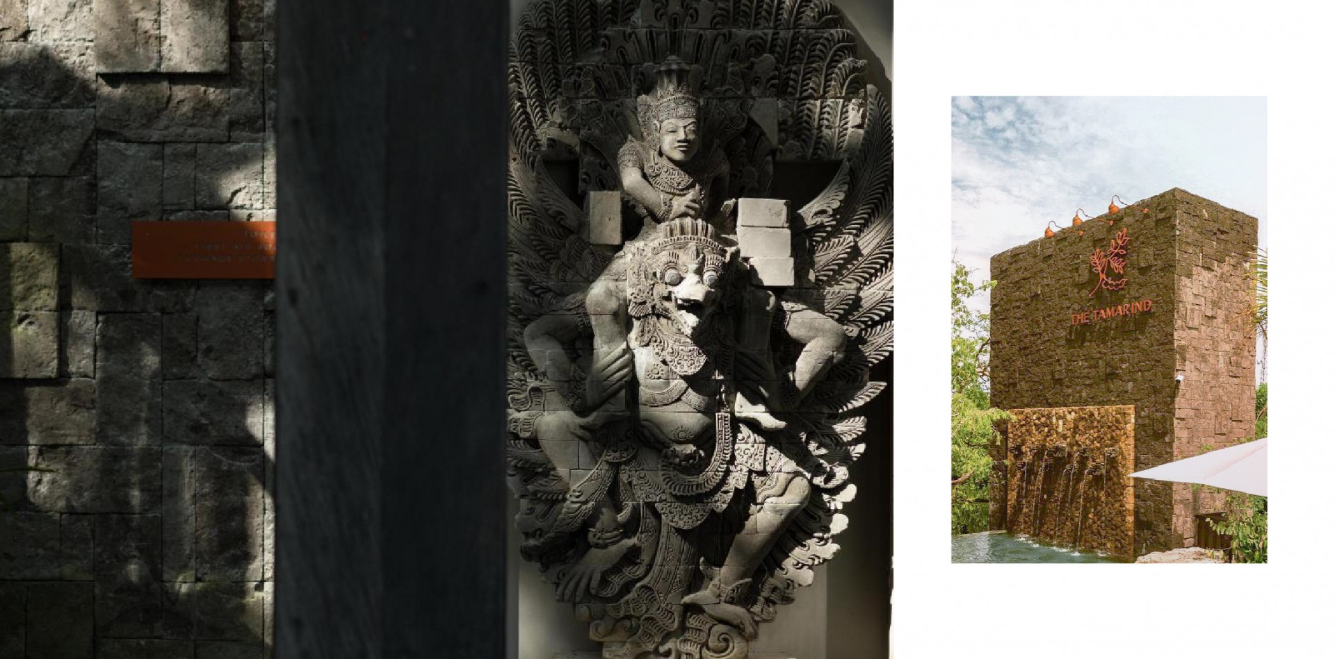
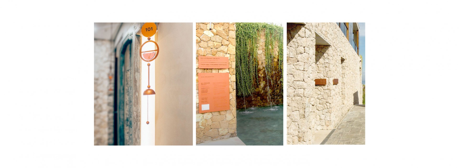
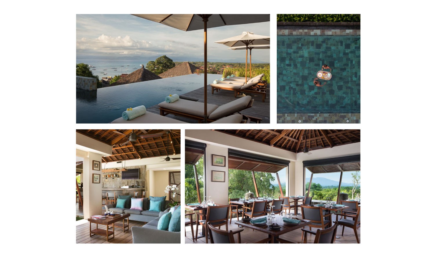
The Tamarind seamlessly marries the natural environment of Nusa Lembongan with a refined contemporary style. Designed to accentuate the slow-paced island, local artisan stone walls decorate the boutique hotel; while a 300-year-old tamarind tree stands as a centerpiece at the entrance. As a luxury boutique resort, it is important for The Tamarind to have a strong character that sets it apart from other establishments in the area.
 

 The place is built from natural stones locally sourced
 The Tamarind Tree is prominent and the central piece of the resort

We started by visiting the site of the resort-to-be.

We wanted to experience a stay in Nusa Lembongan, an island off the coast of Bali that is well known for its close proximity to beautiful dive sites and natural wonders. When we got there, we learned that the hotel is located right off the beach, built on an ascent on the hills and with a direct view to the ocean.

The architecture utilized a prominent use of ivory-colored limestone, providing a rich texture complemented by the warmth of dark timber floorings.

The logomark is a stylized depiction of a tamarind tree branch with its flower, leaves and the iconic tamarind fruit sprouting out of it.

It is a modern version of a classic botanical illustration, with uniform clean lines that still maintains its organic form. The branch gently curves upwards to resemble the harmonious experience of the resort.

It was important that we considered subtle touches to infuse the brand into the environment in a thoughtful manner. Here, we took the tamarind brand mark and made a batik pattern that was applied to a variety of interior accents.

We created the identity to be able to perform at any level. In this case the amenities, the graphic we designed are . . .

With this direction, Studio 1212 was able to produce content that is varied yet familiar, and also used GoSend and GoBox’s logos, watermarks, graphic elements, typography and color palette to ensure the content relates directly to the brand.

Another important element of the guest experience is the resort’s spatial design.

To complement the Balinese natural stone in the built environment, we designed an understated and clean signage system with an elegant copper finish. Its sleek steel panels contrast with the heavily textured walls, and the sturdy build is able to withstand the forces of nature.

One of the signature placemaking objects in the property is our delightful room number signs.

Designed as a one-of-a-kind windchime, the guests can easily flip the pastel-colored plates to signal for housekeeping or "do not disturb".

Indica is the in-house restaurant at The Tamarind.

It is a casual establishment offering hearty oven-baked pizzas, hot dogs, and your favorite Italian fare. Located on the poolside terrace with overlooking views of the ocean, Indica offers a relaxed dining atmosphere for the whole family.

Indica's printed menu and pool bar menu

The Indica identity is an abstraction of the restaurant’s main inspirations, namely the tamarind fruit and the Nusa Lembongan island.

It is a contemporary interpretation of Jungutbatu beach at the magical hour when the sun looms over the horizon, just about to set. The color palette is a vibrant evolution of The Tamarind brand, evoking the dusky hues of sunset charged with a vivid energy.

Amlika Spa at The Tamarind is inspired by the healing benefits of the tamarind tree and its fruits.

At Amlika Spa, we seek to recreate the experience by beautifully combining the best of Asian traditional remedies with treatments and products by a luxury European skincare line.

As Amlika draws from the organic energy of the island and its natural features, this logo features the natural environment of Nusa Lembongan, and the iconic tamarind tree and fruit, drawn in a balanced circular composition.

To present this island escape to the world, we also developed a comprehensive system of marketing materials that can easily be adapted by the in-house team.

The advertising guidelines cover a range of the resort's offerings and a variety of media applications, including print ads, out-of-home billboards, web banners, and more.

The system is efficient and the results successfully capture the laid-back and intimate essence of the resort.

  • Forced From Home
  • Fight The Power
  • There Is Nothing So Stable As Change
  • Daydreaming
  • What Means The World To You
  • Polka Dots And Moonbeams
  • Things In Life
  • For The Good Times